Uber’s Rebranding
Rebranding Def: Rebranding is a term generally used to describe a company’s attempt to change its name, it’s brand aesthetics including its logo, signature tune, and/or reposition its brand with an intention to send out a complete new message about who they are and what they represent.
Even the most successful brands need makeovers from time to time. Since the turn of the century changes in the corporate sector with increasing merger and acquisitions activity, change in corporate strategy, change in external position amongst other reasons has led to many Indian companies to opt for rebranding. Mainstream brands such as Godrej, Shoppers Stop, India Post and CEAT Tyres, Airtel, Hero have undertaken rebranding initiatives to shed their old corporate images and position themselves in a new, more modern light. While some companies such as Godrej has simply upgraded its logos rather than a full blown rebranding others such as Airtel and Hero has dug much deeper with not only a change in logo but also their signature tunes and taglines. In this paper we will try to answer a few common questions which has been on everyone’s mind. What is the difference between an identity refresher and a true rebranding — and when is one, and not the other, needed? Is changing the logo enough? How did most of these companies choose their logos? Have these rebranding attempts really been successful or just a wastage of investor’s money? We will start with a general attempt to define rebranding and understand the issues that could lead to the decision of a company to rebrand. We will end by taking the lessons learnt from the cases of Hero and Airtel which undertook massing rebranding exercises in the near past.
From a corporate rebranding perspective, a paper written by Muzellec and Lambkin suggests that corporate rebranding consists of renaming, redesigning and repositioning, whilst another paper by Daly and Moloney concentrates on the communications aspect of corporate rebranding, that is the launch of the new corporate brand. We will discuss both.
All the rebranding causes can be put into the following categories:
-
Change in Ownership structure: Mergers and acquisitions, Spin-offs and demergers, Private to public ownership, Sponsorship
-
Change in corporate strategy: Diversification and divestment, Internationalisation and localisation
-
Change in competitive position: Erosion of market position, Out dated image and Reputation problems
-
Change in external environment: Legal obligation, major crisises or catastrophes. It is also an effective marketing tool to hide malpractices of the past, thereby shedding negative connotations that could potentially affect profitability
Activities undertaken as part of Rebranding:
Repositioning
This is the objective-setting phase in which a decision is taken to try to create a radically new position for the company in the minds of its stakeholders. Brand positioning is a dynamic process which must be regularly adjusted to stay in tune with shifting times. Market conditions may dictate a more radical overhaul of a company’s position in terms of both what is and how it presents itself.
Renaming
Renaming refers to the actions through which a new name is chosen and adopted for use. The name of an organization is a primary means by which the organization communicates to its stakeholders. Changing the name of a company in a corporate rebranding exercise is the riskiest strategy of all. For a name change to be successful, a company needs to have a clear idea of why it is necessary and what the company expects the results to be. Renaming is by far the strongest signal a company can give to its shareholder about a shift in its strategy, refocusing its activity or changing its ownership.
Redesign
The existing corporate rebranding research suggests that redesigning refers to logo change. The stages of the redesign include examining the present corporate in relation to the external environment, clarifying the central objectives of the new logo, analysing the firm’s brand values and strategy direction to ensure that the new logo will reflect those aspects, choosing a logo structure involving the decisions on the kinds of connections the logo should have to the previous logo and/or corporate products and/or subsidiaries and creation of a logo/symbol, colour palette and font type. The redesign is carried through all elements of the organization such as stationary, brochures, advertisements, reports, offices etc.
Relaunch
Relaunching refers to how new brand is communicated to the stakeholders. Daly and Moloney suggests that launching consists of both internal and external campaigns: an internal campaign consists of communicating the vision and values, and an external campaign includes five events: a pre-campaign situation analysis (clarifying the current situation), a partnership campaign (informing the public about an acquisition), interim or dual branding campaign (in which the old and the new name are used together), a pre-launch campaign (which explicitly communicates the disappearance of the old name in the near future), and an actual launch campaign (involving above-the-line advertising and below-the-line promotion including concept stores, developing wraps and an exciting and publicity-oriented public launch).
Mainstream brands such as Godrej, Shoppers Stop, India Post and CEAT Tyres have undertaken rebranding initiatives to shed their old corporate images and position themselves in a new, more modern light. Godrej used its name as a logo in an uninspired font for more than a century. Godrej decided to change its logo to the vibrant colors green, blue and ruby to give it a fresh contemporary look to reflect the new positioning of ‘Brighter Living’. UTI Bank changed its name to Axis Bank as it takes its initial steps in establishing a global footprint. Shoppers Stop, a chain of retail stores in India, rebranded to keep up with the new challenges in the marketplace. Its new logo, along with the tagline composed to support the logo upgrade — “Start Something New” — conjured a fashionable, young and international image of the brand.
In Uber’s case the reason is purely strategic. If they wanted to shed their negative image( and move away from their recent scandals) they would change their name and not make their name even more prominent in their logo. Some examples and reasons for changing names are mentioned in this blogpost Should You Change Your Company Name?
Uber also focussed just on the Redesign and Relaunch and did not reposition or rename themselves. So we will focus on just these two.

See how different the logos were for Uber and Uber Eats. An earlier post I wrote on Swiggy and Dunzo ended with the hypothesis that all delivery/ride sharing apps will end up becoming super apps to improve ARPU as well as capitalise on their distribution & network effects.
Read the following posts:
Grab wants to build a Tencent-like super-app to rival Go-Jek
Go-Jek, the transport app set to become ‘Super App’
How Go-Jek compares to other ‘super apps’ like WeChat
Many products like Facebook, Linkedin and even India’s Zomato started out by bundling multiple services in their core app before unbundling and launching separate apps focussing on different use cases.
To understand more read the following posts on Bundling and Unbundling:
Unbundling: AOL, Facebook and LinkedIn
How to Succeed in Business by Bundling — and Unbundling
In the 2nd phase of unbundling, the branding aspects matter a lot. UberEats already has a $6 billion bookings run rate. Soon there will be dozens of other Uber services out there started with Bikes which will start by occupying a small space in the core Uber app and then unbundling as a separate application. You want people to associate all of them with the same Uber brand.
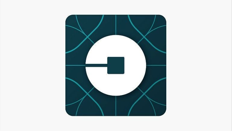
Their earlier logo was pretty meh. Here is The 7-Step-Paul-Rand Logo-Test. See how The earlier logo performs.
A logo and a design system which is scalable was the need of the hour. Something they needed to nail down before their IPO next year when there will be even more scrutiny.
And that is exactly what Uber did. Their redesign exercise involved iterating on their design systems. Going back to a simple logo which can be identified easily. Any new service you launch you can just slap the name next to Uber and you get a new logo.

This is how it looks on my phone.
You can read more about the entire exercise from Uber’s official blogpost here: Rebrand 2018
The only issue I have with the whole exercise is the cost. If you are an online only brand, the cost is far less. Example if Atlassian decides to change their logo tomorrow. You have to change your logo only in your online assets and you will be done.
For Uber, Airtel, Hero etc, it means replacing the logo on each and every billboard out there. But I guess their VCs are okay with it. Their recently hired CMO? Only time will tell.