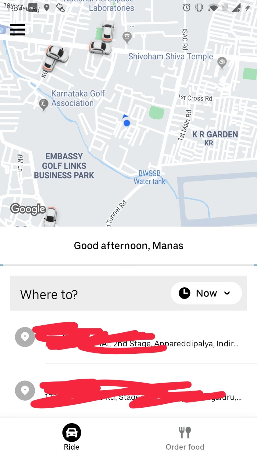
Is there a discovery problem with UberEats?
I wrote a thread recently on whether moving the Uber Eats hook/entry point to the bottom nav bar would move the needle for UberEats. Turning it into a blogpost (with some edits).
/threadstarts

There are 4 kinds of problems which prohibits the usage of a feature/product.
- Discovery/Awareness problem: User does not even know the feature exists. Or it is not top in mind of the user for its category.
- How to measure:
- Check ratio of users using the feature/ users who land on the screen.
- Customer interviews.
- Surveys
- How to measure:
- Use case problem: User has not learned what to use this feature for.
- How to measure:
- Check ratio of users using the feature/ users who are familiar with the feature.
- Customer interviews.
- Surveys
- How to measure:
- Feature inferiority problem: The feature is far inferior to the alternatives and hence people are not using it. Or it is not actually helping the user with the job it hired the product for. This can be validated through UTs.
- How to measure:
- Customer feedback collected through support tickets
- Customer interviews
- Surveys
- Customer satisfaction scores
- How to measure:
- Product lacking features: Users would probably use your product and it has X features. But another competitor has X + Y and hence people use your competitor more or have not found the need to switch to your product yet. You don’t have any game changer features.
- How to measure:
- Customer interviews
- How to measure:
All 4 problems are important to solve.
But the hierarchy is: Solve for discovery > Nudge your users towards using your product more, educate them about the other jobs they can use it for > Make sure your core product does not suck > Build Y.
The problem with FoodPanda and Uber /Uber Eats when it comes to food delivery is not discovery of their product. They might not be top in mind for their category but people do consider them as one of the alternatives.
It is also not a use case problem. People get hungry. They order food. The job is clear. No number of extra notifications will move the needle for them.
What they suck in are problem 3 and 4.
What Uber Eats and FoodPanda have to understand is that they are not in the app business; they are in food delivery business.
What are the things people want from a food delivery business:
- Best price possible.
- Diverse inventory/ More options in terms of restaurants, cuisines available.
- Faster delivery.
- Authentic items/trust in the platform.
- More info/ more recommendation which helps you make the decision on what to order.
What I keep seeing both do instead is: Running experiments on discovery. Basically attempt at solving the type 1 problem again and again when I don’t even think it is the main problem to solve at this stage.
Uber started with putting a hook for Eats in their home screen. Then they tried a switcher at the top (go the super app route). Then reposition the hook at the right. Now they have put it at the bottom as part of their bottom nav bar.
Ola had Foodpanda as 2nd option in ride service type selection (why the fuck would you do that!) while booking a ride a few months back. The icon stood out because of its bright red color (filled red icon vs the normal line icons for other service types). I am sure it did not increase their FoodPanda orders because as someone said once “People do want Ice cream for 9 bucks. What they don’t want is a gooey mikly liquid thing in an hour”. Ola learned its lesson and moved Foodpanda back to the end.
But Uber keeps trying so hard to push Uber Eats.
They should have learned by now that Discovery is not the issue here and they should solve the bigger problems.
But then again re designing the app and adding/moving hooks is the easier thing to do.
Solving problem 3 and 4 are far harder.
Learned this lesson in my previous startups.
/end