Random Design Gyaan 1 - Ticker on Swiggy
A collection of random thoughts on product design which I shared recently on Twitter.
Ticker on Swiggy
Love how Swiggy uses a ticker to show more info in the ratings section of the restaurant page. The ticker starts with rating and number of ratings. Then the number of ratings changes to show feedback on packaging, portion etc.


Earlier ticker UI usage was limited to news channels and flight info at airports; places where you want to leverage the power of scrolling text info when screen estate is limited.
I have not seen many apps use a ticker and it was surprising to discover it on Swiggy.
You can also tap and access feedback around portion size, taste etc.
Pending orders on Google Pay
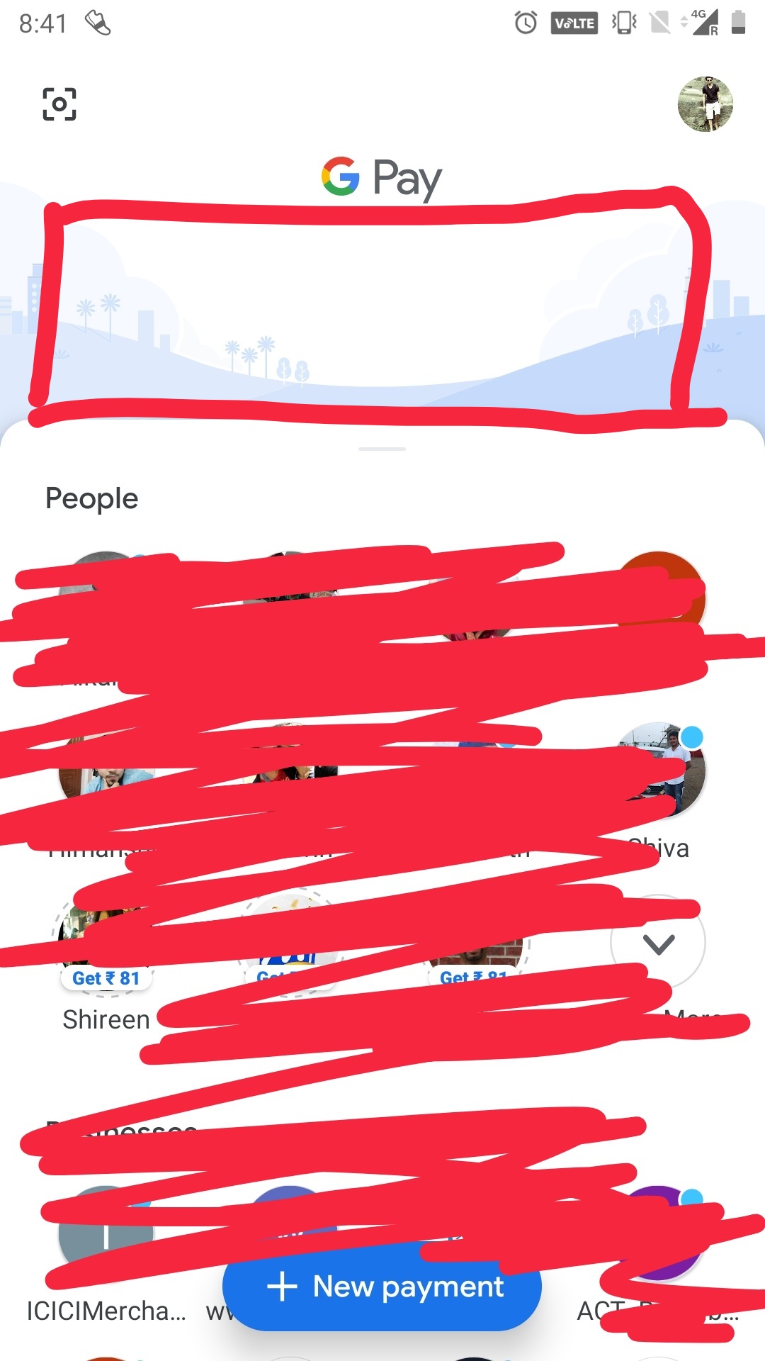
Google Pay seriously needs a card called ‘ongoing order’ at the top of its home screen.

If you initiate a payment using UPI on some merchant platform you have to wait till you get the UPI pay notification which takes you to the merchant screen inside Google Pay.
The problem?
Notifications comes late. Sometimes it does not deep link properly to the correct screen.
If your system knows there is a pending transaction just show it on the home screen. It is the most important JTBD when someone who has a ongoing/pending transaction opens Google Pay.
This is hardly some original thought. This is what Amazon does on its homepage too.
New user experience on Apple products
Something Apple is still amazing at: first time user experience for a new product.
Especially if you are an existing iPhone user.
Setting up the new phone is almost like magic.
Disclaimer: Not an iPhone user. But have heard multiple people gush about it.
Real world virality of Credit Cards
Wonder why no credit card company has tried to make their card stand out. Such a lost opportunity. When was the last time you went out with your friends and when the time came to split the bill, you noticed someone’s card and asked them about it?
A company who has used unique form factor or color to stand out in a crowded marketplace is Apple. White earphones for iPod which get people to notice vs standard black earphones. Glowing apple logo in Macs. Now their titanium credit cards.
Related post: Distinctive design can make consumer products go viral.