Random Design Gyaan 2 - Secret discussion between ICICI designers
A collection of random thoughts on product design which I shared recently on Twitter.
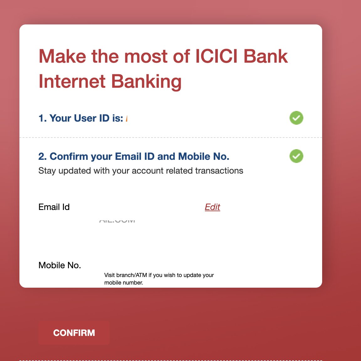
Secret discussion between ICICI designers
ICICI designer 1: kuch machau karte hain bruah.
ICICI designer 2: kya karna hain bata.
ICICI designer 1: ek kaam karte hain laal background mein gradient daalte hain.
ICICI designer 2: sath mein CTA button background mein chupa dete hain…alag mazze.
ICICI designer 1: done.

Why I continue to rant online about how bad bank websites are
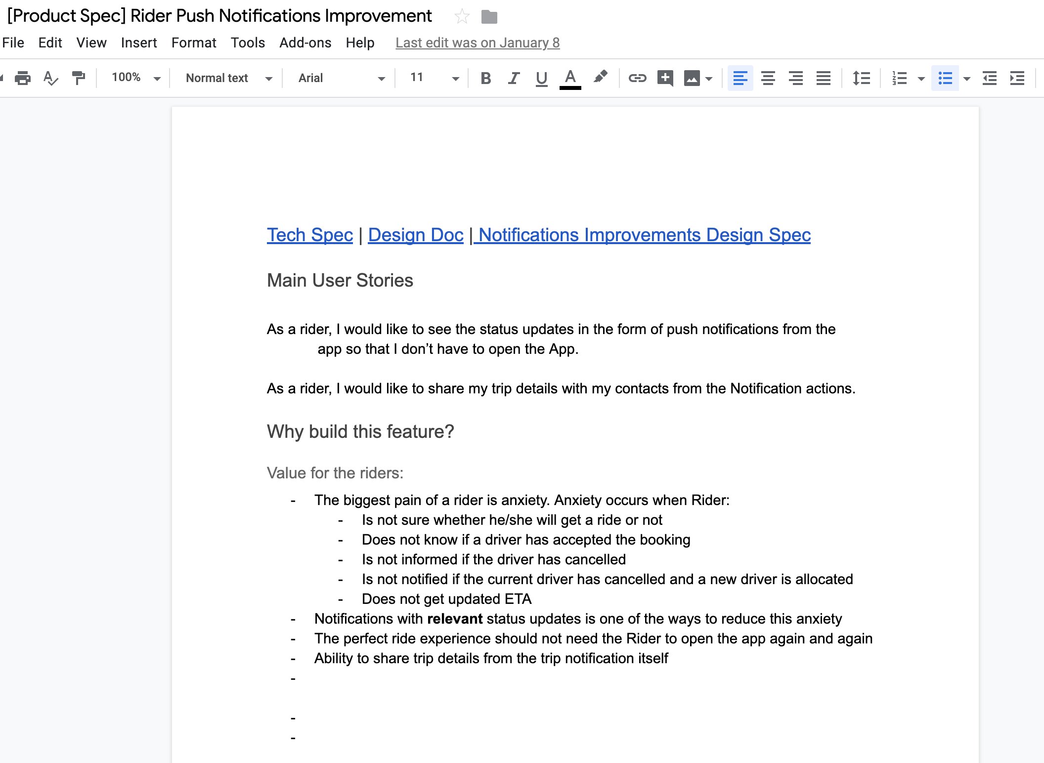
At the place I work, all our product decisions are around minimising rider and driver anxiety. We obsess over small details. Worry endlessly about impact of even small decisions on rider anxiety. Ask if we are giving as much info we can about the status of her ride.
I am not kidding about above. We will spend the next 6 months iterating on our Finding driver screen just so that we can minimise anxiety when rider is waiting for driver allocation.
Below is a screenshot of the spec I wrote on revamping our notification system last quarter.

Hence I get super mad when I see stupid things like hidden CTA buttons.
or when I see ‘Something went’ on the HDFC app like literally everyday.
or when I see a PAY button on a bill I paid a week back.
YOU ARE DEALING WITH PEOPLE’S MONEY.
LIKE HOW FUCKING USELESS ARE YOU.
Every time I use a banking website or app, I come away frustrated. Simple jobs like finding your statements, tax reports take so long.
Cross selling is done with banners in which close button is hidden somewhere.
HDFC ka digital team khud use nahi karta apna app/site kya?
Spam calls karke credit card dilwane mein jitna effort daalte hain uska 10% effort website sudhaarne mein daalenge to existing customers atleast itna frustaenge nahi.
Rating HDFC website across 10 commandments of good products
Just crosschecked, HDFC site is at a solid 0/10 based on 10 commandments of good products