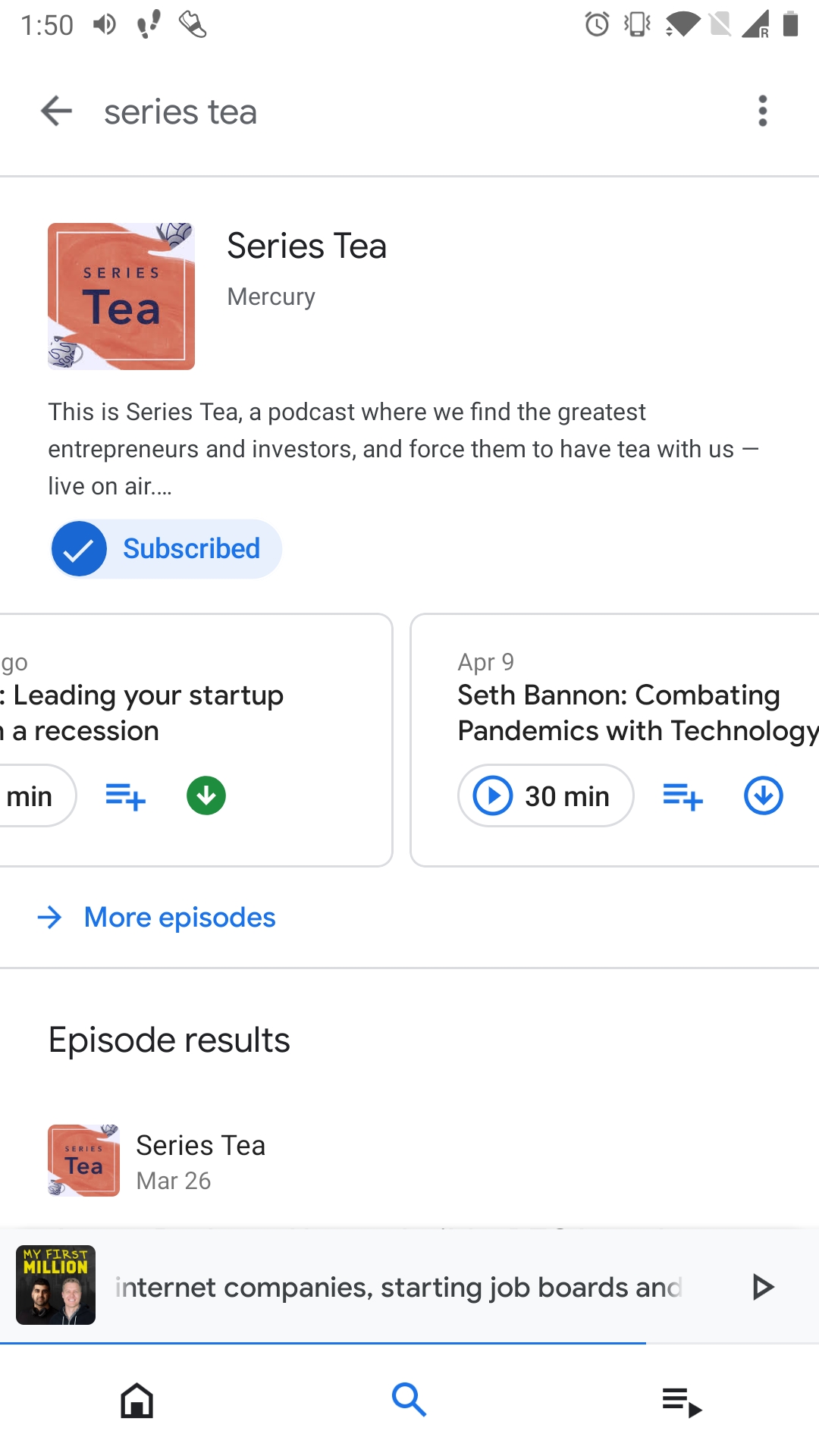
Download button on Google Podcast

Google Podcast app changes the download button icon to filled from line once download happens. The best would have been to just replace the download icon with a check one.
A small change. But a big design improvement in terms of giving user better feedback.
The funny part is that they already use check for subscribed feedback. Not sure why they did not use the same behaviour here.
But then again, they also changed the long press on files/episodes to select it behavior, which is an industry standard.
Now to delete a single file you have to press edit button at top, then select the file and then delete.
So taking bad design decisions seem to be a constant with their team. 🤷
Update: I wrote this post when I first saw the new redesign of Google Podcast. After playing around I realised that check is for completed episodes. So I think Google made the right call. I still stick with my point about the delete interaction though.