2024: A year in review
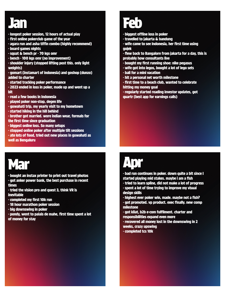
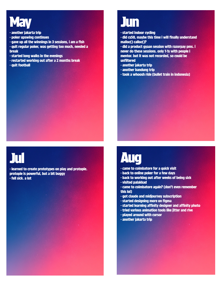
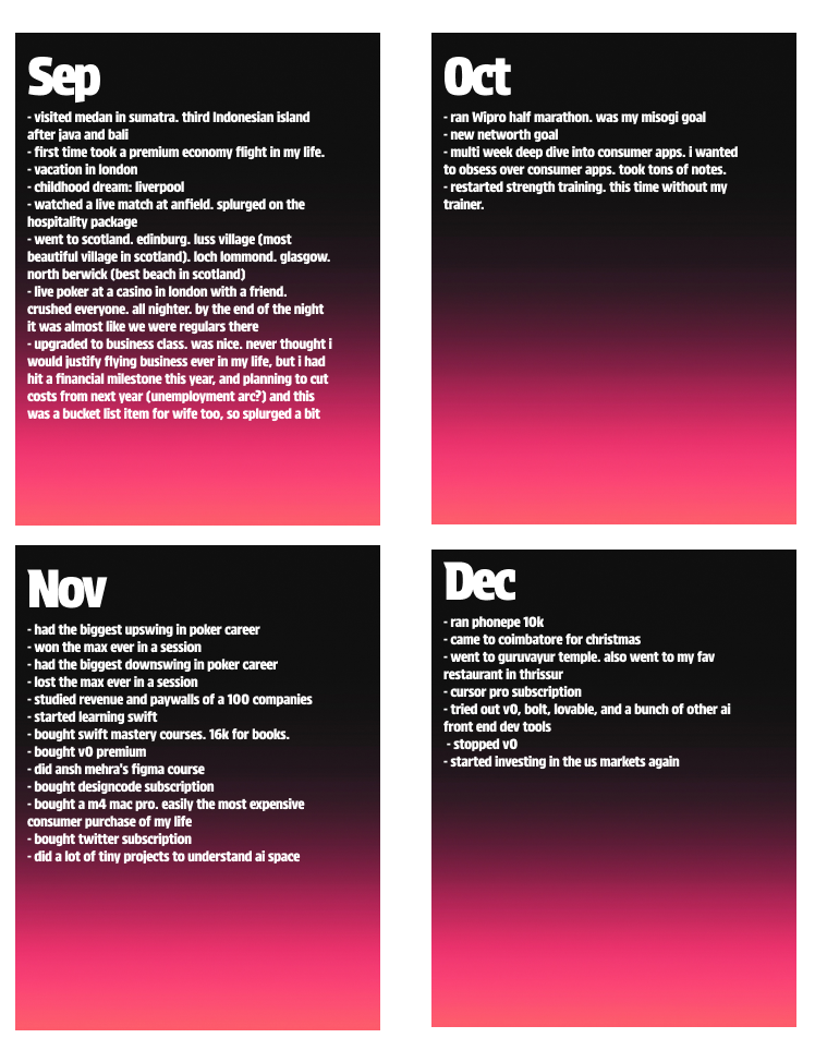
[Cut off date: 25 January 2024]
A bunch of folks asked on x dot com how I put together this year-in-review thing. Figured I’d dump my brain here – might be useless for designers, but maybe the non-design crowd will find it interesting?
Lately, I’ve been kinda fixated on companies and how some of them feel like straight-up cults. Been wondering if there’s a link between that vibe and having super strong, clear cultural values.
So, naturally, I started digging around for examples of company values. Then I remembered Facebook’s red book.
I really liked the texture of those pages. Just got me thinking – could I use that as a background for something I’m designing?Separately, I had this whole booklet thing going on in my head. Like, wouldn’t it be cool to have a website where it felt like you were flipping through a booklet to see someone’s journey? A digital booklet, where you turn the pages and the content changes.
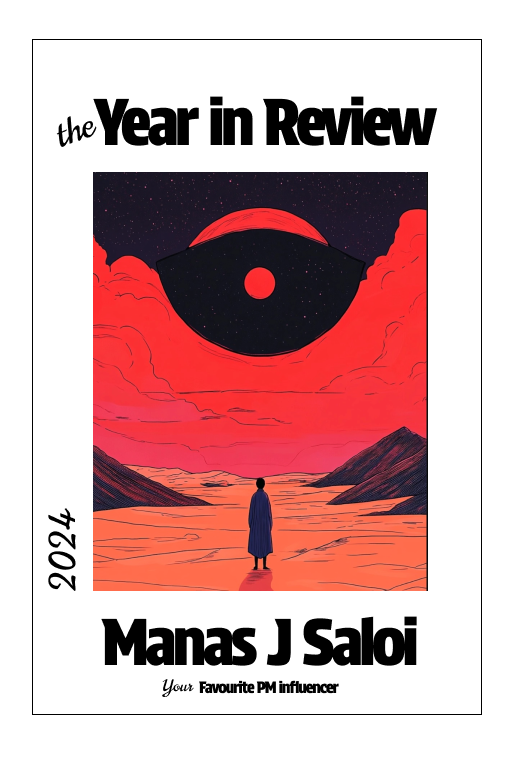
At the same time, I was just messing around with Midjourney, making random images and trying to pull colors from them to create some kind of brand palette.This random anon account had been bugging me about doing my year in review. He was super persistent. And I do it every year anyway.
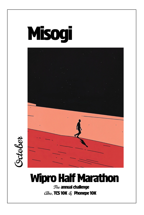
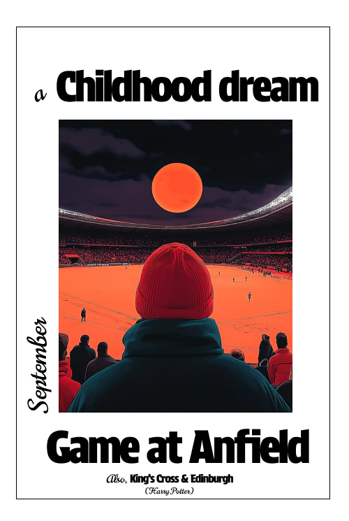
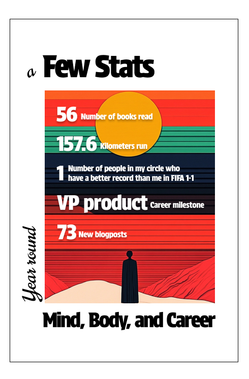
So, I was like, “Okay, let’s just do it.” And that’s how it started yesterday.My first idea was to just smash those two things together. Make a website that looks like a book, where you flip the pages and see my year laid out. That’s why the first page kinda looks like a book cover.I really wanted to use that Facebook red book texture. Make it feel like you’re holding an actual old booklet, seeing how the year went down.In the background, I also had this idea of building a theme around this one initial Midjourney image I created. Using the same vibe, the same environment, and then making more images that fit that.
More ideas just keep popping up. Like, what if instead of just saying where I travelled, I made little fridge magnets in Midjourney? And then had a picture of a fridge on one of the pages, and if you clicked a magnet, more photos and details about that trip. Go full skeuomorphism.
After a while though I was like, “Do I really want to spend so much time on this?” So I just went with the Figma thing and got it done in a couple of hours. Quick and dirty.Most of the time went into just cleaning up the text. Had to take out some personal stuff. And then, of course, the usual rabbit hole of trying out different fonts and gradient backgrounds.
I learned some new stuff. Found out a paper texture generator that uses code. Turns out, a lot of those fancy noise and gradient plugins are just wrapping this kind of thing. And that Midjourney has a ton of gradient backgrounds already built in. The backgrounds for the monthly views? Yep, straight from Midjourney.
Ended up collecting more textures, more images. Finally feeling like I got my money’s worth out of that Midjourney subscription.